Layered Landscapes
Posted on January 04 2018


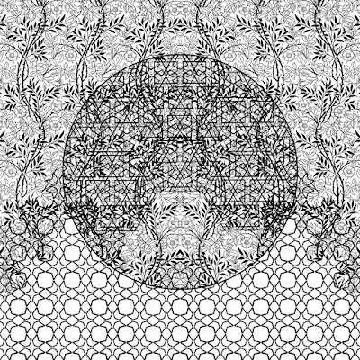
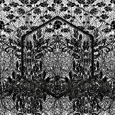
Scope Miami, my biggest show of the year, was fast approaching, and I needed to make something new. I decided on landscapes, a genre I hadn't focused on since the beginning of the year. Experimenting with portraiture, I had made a few pieces the past months that utilized multiple layers of cut paper. I loved the effect, how all those intricately cut patterns floated over each other, casting different shadows onto the layer below. I decided it was time to apply the same ideas to a landscape, and I started work on Auctus and Verum.
Using Photoshop, I created a layout of each artwork to figure out where I'd be cutting. I used to be less predictable and eyeball where I wanted the pattern to go, but when it comes to numerous patterns over different layers of paper, I have to plan ahead. Choosing patterns and deciding where'd they go was always a part of my process, but now the majority of it happens on a computer screen instead of with the physical artwork.
After I finished each layout, I realized there was a problem. The artworks seemed so overwhelming. My adoration for intricacy might have gone a little overboard. With all those designs and shapes interacting with each other, I hadn't left any room for the eye to rest and take a break, an essential part to any good artwork. Instead of trying to fix the problem digitally, I told myself I would just keep an eye on the artwork as I cut it and make sure to find areas that could offer relief from all that detail.

From my individual perspective, that's what I accomplished. I left large sections of the top and bottom of the photograph untouched, which added needed weight and balance to each collage. I took out some pattern from other areas so that more white showed. The compositions worked, and I was relieved.
The overall effect in each artwork came uncannily close to the thoughts I wanted to convey. I don't always get to say that about an artwork, so it's a fulfilling moment when I can.


0 comments